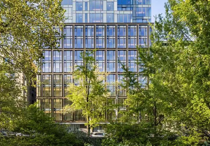
A glass and bronze facade adds a modern touch to the historic park perimeter.
This new residential building from GLUCK+ is located on a shallow lot on West 110th Street, right on the northern edge of Central Park. The building's massing comprises two main elements. The lower volume is clad with a highly articulated facade that continues and contributes to the richness and rhythm of the established streetscape with its deep bronze grid. Above, the set-back upper volume is wrapped in a glass skin that complements the glazing pattern below. In both volumes, the generous floor-to-ceiling windows give all of the building's floor-through apartments unobstructed views south over the Park, and north toward upper Manhattan.
Acelab met with GLUCK+ principal Thomas Gluck to learn more.
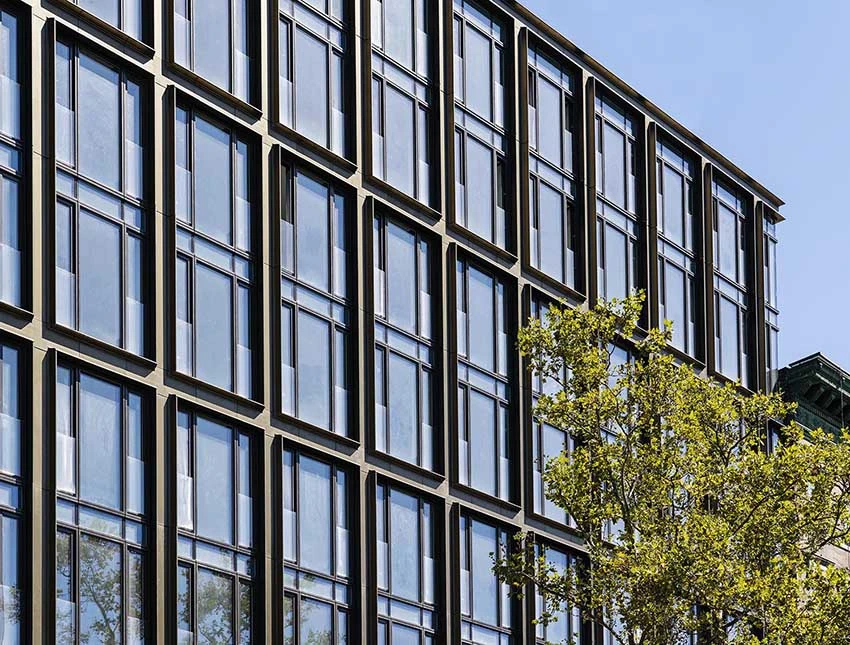
The bronze-colored profile gives the facade a warmth and depth that complements the historic facades along Central Park. (© Image by Chris Coe)
Acelab: How did the windows help you realize your concept for 145?
Thomas: The building is 13 stories with maximized FAR, but we wanted to create a street face that maintained the scale and character of the neighborhood even though the building is far taller than the ones next to it. Now, we didn't want to recreate lintels, dormers, or neoclassical details like its neighbors, but we wanted to be contextual in a contemporary way.
So we wanted to articulate the three portions of a building—base, middle, top of base, and top of building. We made a very strong delineation between the middle and the top, which is where our first zoning setback happens. And we wanted that to be differentiated from what happens above it. But in addition, one of the things about almost all older buildings is that they have much more depth and texture so we worked hard to provide that richness in the lower portions of the building. In order to further reduce the impact of the size of the building, each element covers two floors, so we have 4 elements on the base instead of the actual eight floors expressed.

The view from Park Drive. On sunny days, 145’s glass-wrapped top reflects the sky. (© Image by GLUCK+)
Acelab: What challenges did the site present?
Thomas: The location is probably the most important part of the overall design. It is on Central Park North, which is the least developed of all of Central Park’s street frontages but still one of the 4 walls that define the park. It's a tremendous opportunity because it’s a different view of Manhattan with a whole series of new buildings along 57th St. So maximizing the views is crucial.
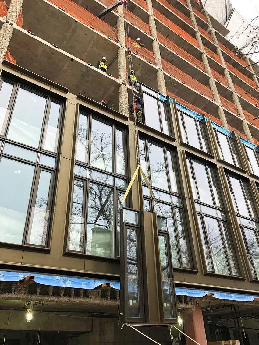
Installation of the prefabricated curtain wall units. (© Image by GLUCK+)
We wanted a lot of windows, so a curtain wall became a logical solution technically. Yet we wanted a pretty distinct articulation with a lot of depth and texture. We spent quite a bit of time trying to figure out how to achieve this through a unitized curtain wall [by WICONA]. The whole facade was pre-built in a factory in Italy, shipped here, and erected in a very short time frame.

Diagram showing assembly of curtain wall and the extruded profile on the lower volume.
Acelab: So the base and the upper section use the same system just detailed differently?
Thomas: Exactly. So the upper part has been articulated as kind of a pretty traditional completely flush system, the windows all swing in. There are no profiles, the only thing you're seeing is the lines of the joints of glass. The upper part which really is all taut glass reflects the environment around it, you know, on this clear blue day reflects the color of the sky, but on a cloudy day equally reflects the color sky.
On the lower part, we didn't want all that much reflectivity, we wanted more depth in order to have it mesh with the existing streetwall. This was achieved by adding an additional profile. The bronze-colored profiles are a powder-coated custom extrusion. It's two pieces mirrored and then there is one in the middle. There's quite a bit of joinery that we had to pull off. There's a stack joint, which allowed all of this joinery with these miters to all happen in the factory very precisely.

(© Image by Chris Coe)
Acelab: And these windows are operable?
Thomas: There is a huge amount of visible glass so you could see out to the park, but we also wanted operable glass. The lower part has full-height swing casements so that on those nice spring and fall days, you can open all those windows and really feel like you're in the park instead of just looking through a plate glass window. We had these windows swing in and this glass balustrade is sort of like the Juliet balcony. It allowed us to not have these windows stop at four inches, which would be the New York City Safety Code.
Acelab: How did you reconcile the exterior expression and the user experience on the inside?
Thomas: One issue with using a curtain wall in residential settings is the association with more institutional or commercial work. You can pick a color, but it's still an awful lot of aluminum and the width and size of the dimensions are pretty much fixed. We wanted to frame the view and the natural beauty of Central Park so we clad all the aluminum on the inside with a frame in white oak, which is the same material as the flooring [by Kember Kreative Floors].
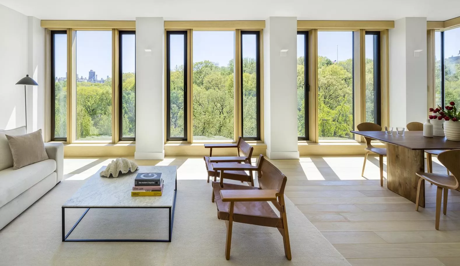
Inside, 145’s windows are clad in white oak. (© Image by Brad Dickson)
Acelab: What were some of the challenges of working with manufacturing on these custom Windows systems?
Thomas: We were the designers and contractors which meant we could collaborate closely with subcontractors, design consultants, and actual tradespeople early in the process making everything smoother, but it also allows us to really push the design to its limit.
Since the extrusion was a custom die, we couldn't ask for a mock-up of the actual profile without committing to the die. So instead we worked our way up from full-size paper models, to ones bent out of sheet metal. We tried different materials as well, stainless steel and copper, but ended up with aluminum because of the softness of the curves and then painted it to look like bronze to reflect the light and add a warmth to the façade.
Acelab: What kind of windows are on the ground floor?
Thomas: We wanted something that reduced the scale and felt appropriate for the pedestrian, because there is no retail — only a residential lobby and a garage. There are large lengths of surface that had no articulation, so we employed a system of alternating and varying widths of stone and glass to animate the 100’ long frontage, including a big motorized sliding door for the garage entry.
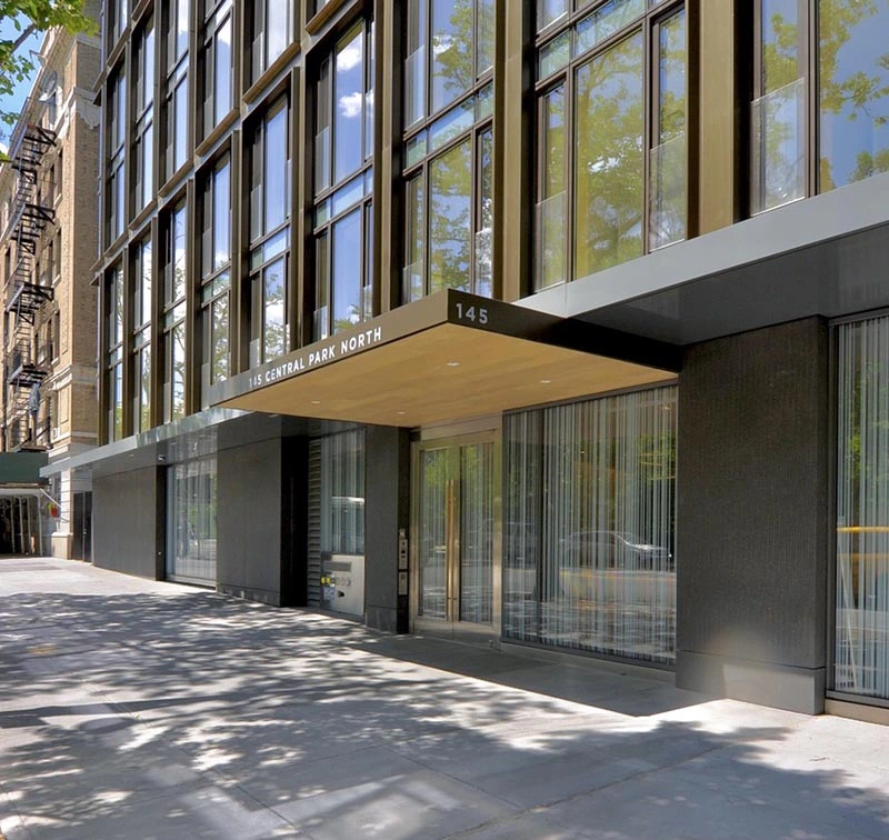
145’s front entry. The ground floor facade is composed of alternating slabs of stone and glass. (© Image by GLUCK+)
We came up with a very custom glass solution. It is a striped frit on all four surfaces of the window—both sides of both panes in the double glazed window which gives the glass depth and animates it as you walk by due to the interaction of the line patterns like a moiré effect.
Thanks to Thomas Gluck and the GLUCK+ team. Read more about 145 Central Park North and all their projects at gluckplus.com.
This interview was conducted by ADvsCOPY for Acelab. It has been condensed and lightly edited.

